

SCOUT
Challenge: Design a mobile application that could benefit both the buyer and seller at a Farmers' Market
Deliverables: User Research, User Flow, Sketches, Wireframe, Prototype, Mockups
Tools: Google Forms, Photoshop, Illustrator, Miro, Adobe XD
My Role: UX/UI Design
Problem Statement
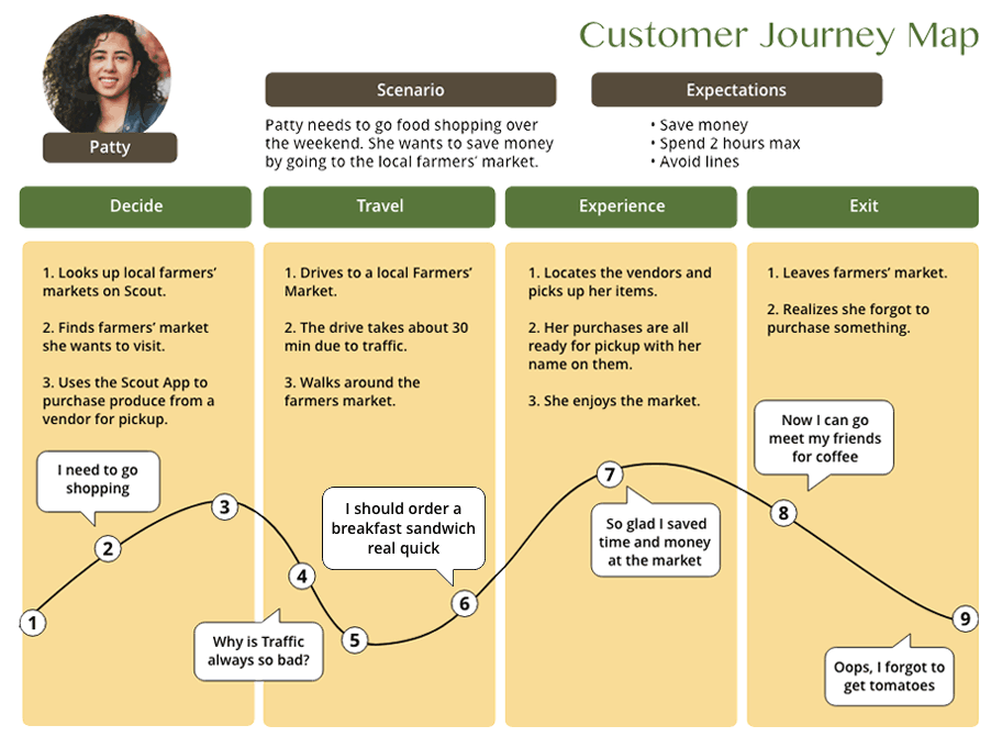
People prefer purchasing fresh, locally grown vegetables at a Farmers' Market because they value the superior taste and quality compared to mass-produced supermarket options. However, despite this preference, many individuals find themselves lacking the necessary time to visit these markets regularly. Busy work schedules, family obligations, and various other commitments often limit their ability to fully enjoy the benefits of shopping at a Farmers' Market.
Background

Main Learning
Buyers and sellers could greatly benefit from a smartphone application that has the capability to revolutionize their experience at the local Farmers' Market. This innovative app would allow users to effortlessly pre-order a wide range of fresh produce and other enticing products from the comfort of their own homes. In addition to being advantageous to consumers, it presents a wonderful opportunity for retailers to increase their income streams by capitalizing on the enormous potential of an online customer base.
Hypothesis
The Rise of Farmers' Markets in the United States
Farmers' Markets have emerged as a popular shopping destination across the United States, with over 8,000 such markets currently in operation. One of the prominent reasons for the surge in popularity is the aftermath of the pandemic. With the global health crisis reshaping the way people live, shop, and connect, there has been a noticeable shift towards outdoor shopping experiences. At the core of their success lies the opportunity to purchase locally grown, high-quality produce at comparatively lower prices than those offered by traditional stores. Why it would be extremely beneficial for both the customer and the seller to utilize a mobile application that links it all together.
The Why
This platform would also make it a perfect integration for businesses that produce comparable products but are prevented from selling at a Farmers' Market because of a waiting list. By providing an online marketplace, these businesses could reach a wider customer base and expand their sales beyond the limitations of physical markets. Moreover, this platform would offer a seamless experience for both sellers and buyers, with intuitive navigation and secure transaction processes.
Business Opportunities
Research
User Survey

I surveyed 30 people to collect sufficient data. Primarily to learn about their technical skills, how they use mobile applications, and to get a basic understanding of their shopping habits at a typical Farmers’ Market. This greatly influenced how I designed my initial prototype
What they like to purchase when they go to the Farmers' Market

How often do they go to the Farmers' Market?
“I don’t go often enough because of time constraint ”

“Weekends I am always busy. I would love to order produce for pickup”
User Persona


Supporting Small Businesses

I interviewed with over 20 vendors for my qualitative data. The majority were small businesses that relied heavily on the Farmers’ Market for sales. Generally speaking, they had trouble understanding technology and finding the means for online marketing.

Ideation
Information Architecture

Design
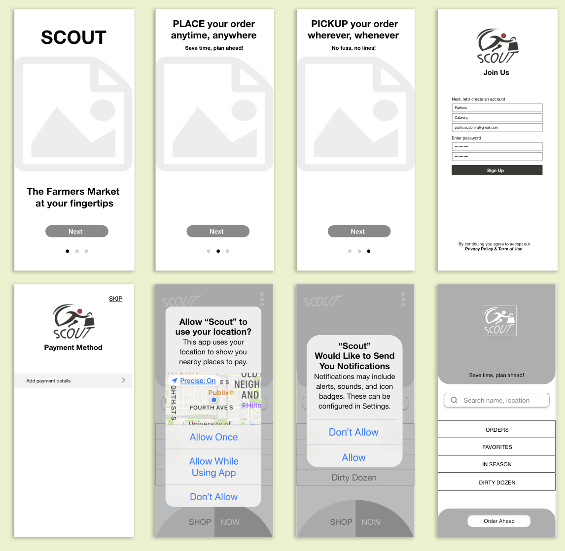
ONBOARDING
The sign-up process was made easy to save time and to engage users. The main objective was to allow users to use the app without needing to add a payment and start exploring the app immediately.


Design

SELECTING & ORDERING
The next step in the process entailed carefully selecting a product that captured the essence of the local Farmers' Market, ensuring that every detail would contribute to a seamless and enjoyable experience for the user. It was of utmost importance to convey a sense of excitement and urgency, as I wanted to emphasize the advantages of planning ahead and saving time. With this in mind, strategic subheads such as "save time, plan ahead" and "no fuss, no lines" were thoughtfully inserted, guiding the user towards a stress-free and efficient path to acquiring their desired fresh, locally sourced goods.

Design
Concept:
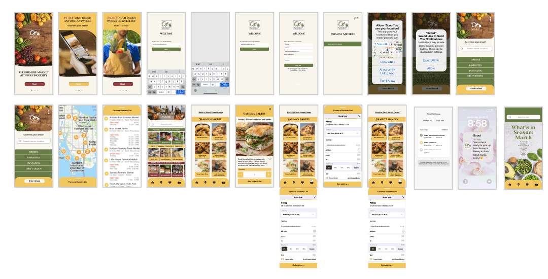
Before arriving at the high fidelity prototype, the design process went through several stages, including mind mapping, card sorting, sketching, and wire framing.

Low & High Fidelity Prototype


Additional Features
Based on the comprehensive survey conducted, I found that a significant number of enthusiastic participants expressed their belief that the incorporation of a range of additional and exciting features would undeniably enhance the overall value and appeal of the application in question. The diverse responses received from the participants highlighted their genuine interest in seeing the implementation of these features, as they perceived them to be crucial for an enriching and fulfilling user experience.

Style Guide

Summary
Key Takeaways
In this fast-paced era, where time seems to slip through our fingers like sand, individuals from all walks of life face the constant struggle of managing their ever-shrinking schedules. It has become evident that the majority of people yearn for an innovative solution that can alleviate the burdens of time constraints and create a sense of harmony in their daily lives. This is where the Scout app steps in, a revolutionary application designed to transform the way we navigate through our busy routines by ordering from the Farmers’ Market in advance. It not only benefits the users but also serves as a remarkable opportunity for merchants and venues to enhance their revenue stream, tapping into the immense potential of a time-starved customer base.


Future Roadmap
Based on Usability Testing
Include delivery and shipping.
Separate mobile app to onboard sellers.
Onboard vendors outside of Farmers’ Market.
A map integration to locate vendors.
Feature vendor’s recipes and tips.
A directory of Farmer’s Markets in the U.S.
Recipes using seasonal products.
Price comparisons and special sales.
Fun food facts and pictures.
