

Seasonal Skincare
Challenge: Translate the product's seasonal diversity through a visual perception of the brand.
Deliverables: Product design, branding, photography, packaging design and print production
Tools: Photoshop, Illustrator, InDesign, Sketch
My Role: Product Designer, Marketing Director
The world's first line of products to address the seasonal changes to your skin and its surroundings.
The Art of Branding


ABCDEFGHIJKLMNOPQRSTUVWXYZ
abcdefghiyklmnopqrstuvwxyz
Primary Font: LATO LIGHT
WINTERSPRINGSUMMERFALL
The Seasonal Skincare Journey
What distinguishes these skincare products is a formula of ingredient that specifically combat the harmful effects of the environment. Recognizing the importance of catering to a wide range of skin types and concerns, the stakeholders of this brand believed that an equally diverse design approach was required to effectively communicate the potency and versatility of their products. To address the ever-changing needs of consumers as seasons shift, my team of designers strategically alternated colors and incorporated thoughtful iconography into the packaging, while still maintaining a cohesive aesthetic. This design choice not only caught the attention of potential customers, but also served as a visual cue for them to recognize and adapt their skincare routine accordingly.
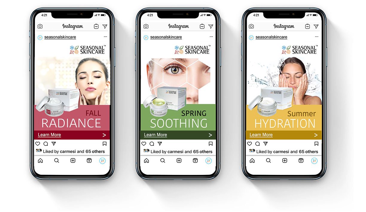
Informed by extensive user research, the brand campaign also incorporated an educational element to empower consumers with knowledge about their skincare needs in general. It was discovered that a large majority of people lacked a deep understanding of their own skin and how to properly care for it. To bridge this knowledge gap, specific headlines and more in depth information were used in the brand's print materials and social media posts.

Final Thoughts and Takeaways
In the realm of design, the focus is always on the end user and their perception of the product. It is crucial for product designers to create incentives that are compelling enough to drive consumers to want to try the product. By meticulously identifying the unique needs and preferences of our target audience, we were able to effectively convey our message and cultivate a strong connection. This connection was established through a combination of strategic choices in colors, shapes, and even the language used in our designs, ultimately enhancing their overall satisfaction and engagement.

